A shipping tube looks like the simplest package a brand can buy: a cardboard cylinder and two caps. That simplicity is exactly why the ordering mistakes are so common and so expensive. The errors do not show up in the proof or the first sample. They show up weeks later as crushed corners, popped-off caps, contents that arrive with a permanent curl, or an invoice with an oversize surcharge no one expected. Almost all of them trace back to five decisions made too quickly at the specifying stage. Here is where custom tube orders go wrong, and how to get each one right.
Mistake 1: Confusing inner diameter with outer diameter
The single most common tube error is ordering by the wrong diameter. Tubes are specified by inner diameter, the usable space your rolled contents sit inside, but shipping is measured by outer diameter, the wall-to-wall width the carrier uses to figure girth and dimensional weight. Ask a supplier for a “3-inch tube” without saying which number you mean and you may receive a tube whose 3-inch measurement is the outside, leaving an inside too tight for the print you meant to roll. Order by inner diameter, match that inner diameter to what you are actually rolling, and remember that the outer diameter is inner diameter plus twice the wall thickness.
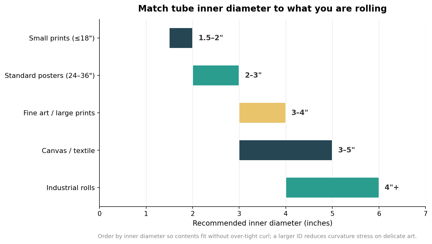
The chart gives defensible starting points: roughly 1.5 to 2 inches for small prints, 2 to 3 inches for standard 24 to 36 inch posters, and 3 inches and up for fine art, canvas, and textiles that crack or crease when forced into a tight curl. A larger inner diameter reduces the curvature stress on delicate material, which is why premium art rarely ships in a narrow tube even when it would physically fit.
Mistake 2: Under-speccing the wall thickness
The second mistake is choosing wall thickness by price alone. A thin wall costs less and weighs less, but thin-walled tubes kink and collapse over long transit, and a kinked tube transmits the damage straight to the contents. Mailing tube walls fall into recognizable grades: about 0.06 to 0.08 inch for lightweight local mail, 0.08 to 0.12 inch for standard eCommerce posters and retail prints, 0.12 to 0.18 inch for high-value or international shipments, and 0.18 inch and up for industrial heavy-duty use.
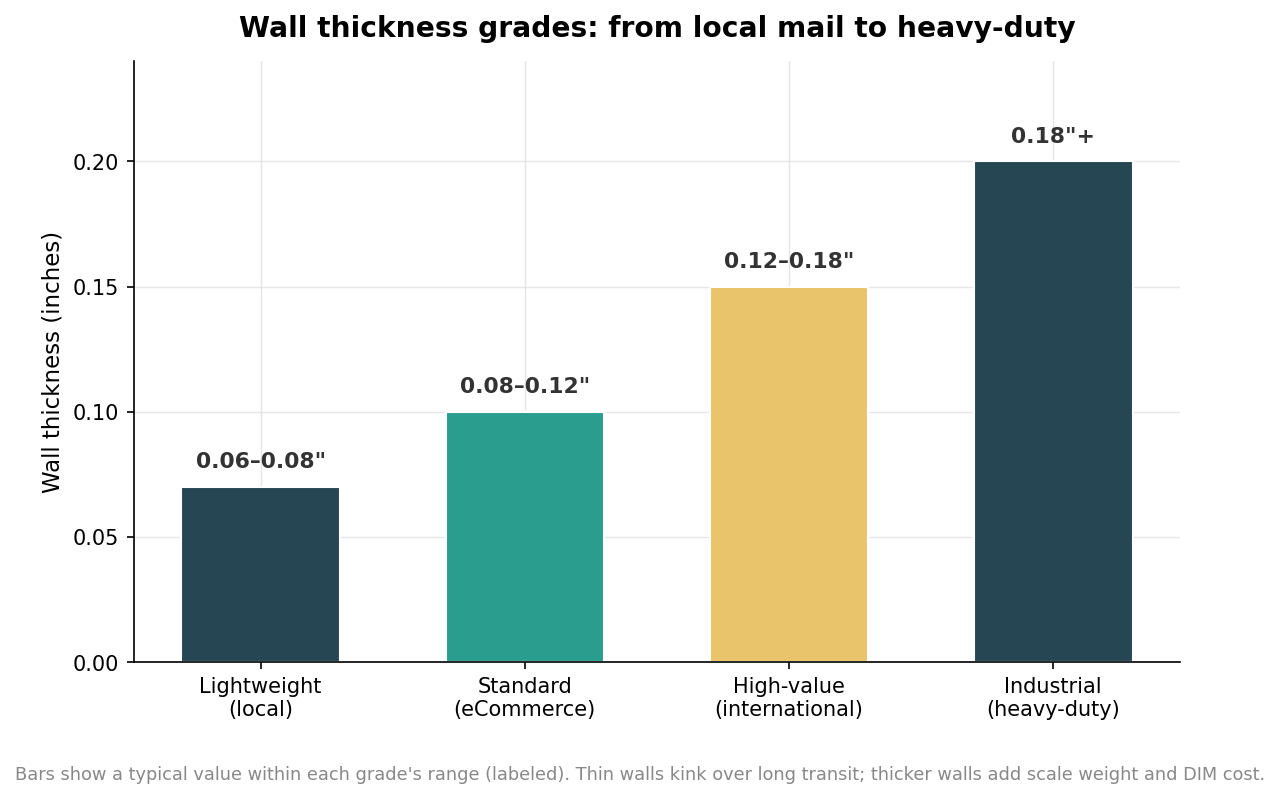
The trade-off runs both directions. Too thin and the tube fails on a cross-country journey through automated sortation; too thick and you are paying for board weight that adds to the scale weight and, on a large tube, to the dimensional weight the carrier bills. Match the grade to the value of the contents and the distance they travel, rather than defaulting to the cheapest wall to shave a few cents a unit.
Mistake 3: Sizing the length with no clearance
Length errors cut both ways. Order a tube exactly as long as the contents and there is no room for the end caps to seat properly, so the caps bulge, the closure strains, and the ends crush first. A workable rule is to add roughly one to two inches to the length of the rolled item for a safe fit, and about three inches for heavy industrial rolls that need room to move. Erring long has its own cost, though: carriers apply oversize or nonstandard fees once a package passes length thresholds in the range of 22 to 30 inches, and international shipments crossing about 36 inches can jump from standard parcel pricing into freight. The goal is the shortest tube that still leaves clearance for the caps, not the longest tube that happens to be in stock.
Mistake 4: Treating end caps as an afterthought
Caps are where a tube actually fails in the field, yet they are usually the last thing specified. A plain friction-fit plastic cap is fine for light, low-value contents moving a short distance, but under rough handling those caps work loose and pop off, and a tube open at one end delivers a crushed or empty package. For anything valuable, long, or heavy, step up to a stapled closure or a locking cap that twists or snaps into place and cannot be jostled off. It is also worth confirming the cap fits the specific wall and diameter you ordered, because a cap sized for a different wall thickness either falls out or refuses to seat. The cap is not an accessory to the tube; it is half of what keeps the contents inside.
Mistake 5: Designing artwork that ignores the tube
The last mistake is treating a tube like a flat sheet. Print wraps around a cylinder, so a design has a seam where the wrap meets, and artwork that ignores that seam ends up with a logo split across it or a pattern that visibly jumps. Curvature also means only part of the print faces the customer at any moment, so the key brand elements should repeat around the tube rather than sitting in one spot. Decide early whether the end caps are a matching color or a contrasting accent, keep critical text away from the seam and the capped ends, and extend any background fully to the edges so a slight shift on the wrapping line does not expose bare kraft. A tube that is specified correctly and printed with its shape in mind arrives intact and on-brand, which is the entire point of paying to customize it in the first place.
Leave a Reply